Whether you’re dying to know the best Pinterest image size, or how to get more clicks, we answer all your burning questions about Pinterest images.
Creating incredible images is one of the most important tasks when it comes to your Pinterest marketing. Those images will capture the pinner’s attention and lead to clicks to your site. And those clicks are what lead to conversions.
For some of you, creating images is an escape. You love the design aspect. For others, creating images makes you want to throw your computer across the room. I definitely fall into the latter category.
Regardless of which category you fall into, Pinterest images are different than the images you find on any other social media platform. You should always have the pinner in mind when creating your images.
In today’s episode, my former creative director, Tina, and I are answering the five most commonly asked Pinterest image creation questions. These are the questions we field ALL THE TIME.
How Much Time Should You Devote to Image Creation?
There was a big push to jump on the Pinterest image creation bandwagon recently with Pinterest saying that fresh pins are what will get you the best distribution. This caused many creators to shift their focus from content creation to image creation.
But exactly how much time should you carve out for this Pinterest marketing task? It’s a hard question to answer because there isn’t a one-size-fits-all answer.
If you are using image templates, Tina believes that finding the branded image you want and tweaking the images shouldn’t take you more than 20-30 minutes per image. If you are building a brand new image with multiple layers, then expect the image creation process to take up to an hour per image.
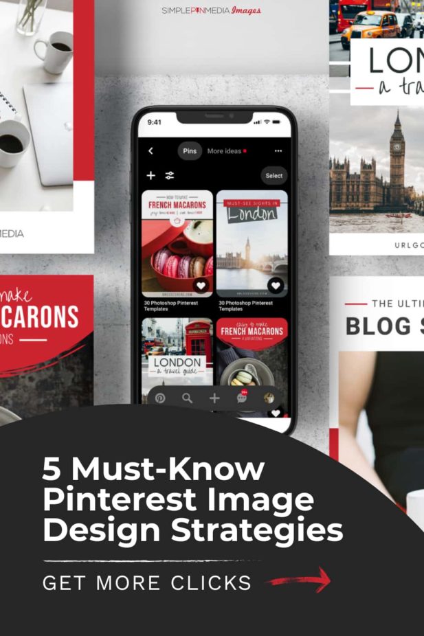
Top 5 Pinterest Image Creation Questions
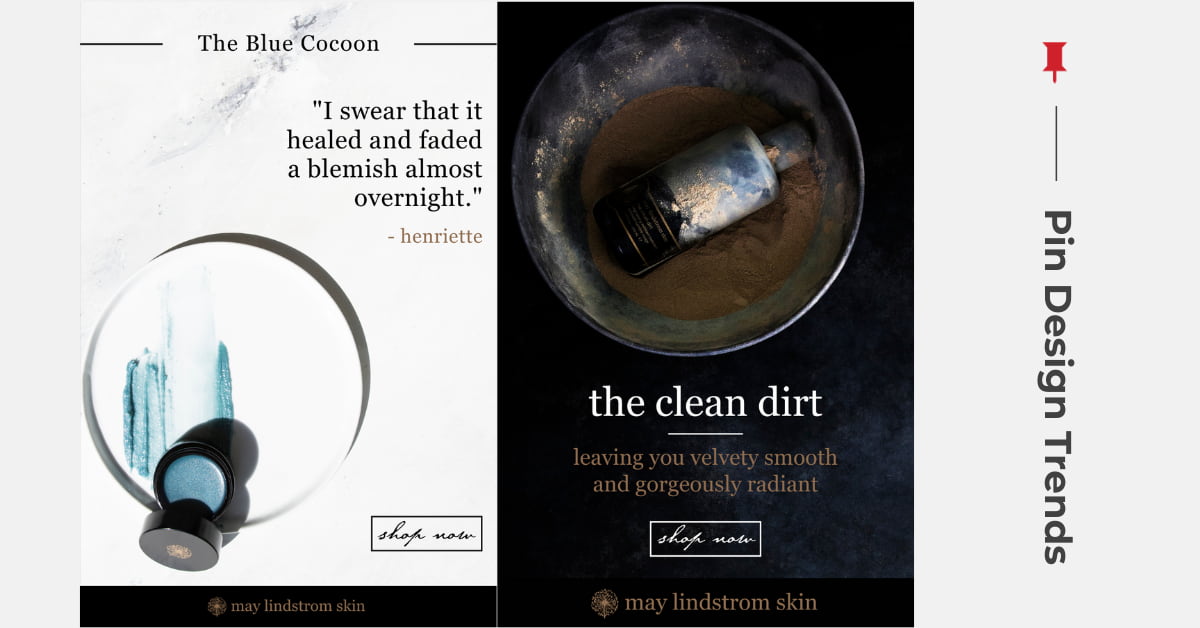
Q: What types of Pinterest image designs are currently trending?
Right now, in 2020, we are seeing a trend toward light and airy images. Less is more. Uncluttered, simplistic, minimalistic designs that make use of white space are definitely performing well.
If you look at what big brands are doing, and if you use Pinterest as a normal user would, you will see that promoted pins are simplistic in nature.
If your brand is not light and airy, you don’t have to worry. Regardless of your brand colors, you can choose photos that are more simple. Look at images that are trending and see if you can work those types of examples into your image creation.
The image below on the left is a great example of the light and airy trend:
Q: What design techniques can get me more clicks?
This is the magic question. More clicks are what we all want.
The answer for Tina always comes down to one thing: you have to be creating images specifically for mobile. Over 85% of Pinterest users are using their mobile devices to look at Pinterest.
Most of us are designing our images on our desktops, where they are two to three times larger than they are on mobile. We upload those images without ever checking how they appear on a mobile device.
About half the time during Pinterest image consultations, Tina encounters fonts that are too tiny to read, colors that don’t have enough contrast to stand out, or script font keywords that are impossible for Pinterest AI to read.
The key to avoiding all these issues is to simply upload these images to a secret board and then look at them on your phone. Taking the few extra minutes to do this will save you from sabotaging clicks down the road.
If script fonts are part of your branding, use them carefully and strategically. Combine your script font with a sans (non-script) font. Use your script font for phrases that are not keywords or designed to encourage clicks.
If you don’t love image creation or it feels like it takes a big chunk of your time, check out our easy to use Canva Pinterest templates.
Q: What Pinterest image size should I create? (and do long pins still have a place on Pinterest?)
Within certain industries, long pins are converting better than the traditional size 2:3 ratio pin images. Keep in mind that we do not encourage anyone to create long pins exclusively, because you have to work with the Pinterest algorithm.
For longer pins, the 600×1260 is the sweet spot. It’s important to A/B test your Pinterest images to learn what works for you. It’s the only way to learn what designs your people are most likely to engage with.
You don’t want to limit yourself when it comes to your Pinterest image size. Learn what works for you and your audience before cutting anything out.
Related: Pinterest for Real Estate: How One Real Estate Agent Is Killing It
Q: Do I really need to use text on my pins?
Lots of food bloggers are shooting amazing photos and are super proud of them. The last thing they want to do is cover up those beautiful images with a text box.
But if the goal is to drive clicks, it’s important to keep in mind that text plays a vital role. Pinterest visual search uses text to rank pins. The Pinterest AI can’t taste your recipe so it needs to be able to read the keywords to properly rank it.
The Pinterest user also clicks on images with text more than on those without it. If an image has no text, the user will typically bypass it in order to click on the one next to it that contains the words “30-minute Paleo Casserole Recipe”.
In every single image test that Tina has conducted, clicks are substantially higher on the images that had text overlay.
Just like with every other aspect of Pinterest marketing, there are exceptions to this rule (as outlined in this post on Pinterest for Realtors). As always, you should test it out on your own images to see what works for you and your audience.
Q: Does the copy on my pin have to match my blog title?
If your blog post is “5 Commonly Asked Questions About Pinterest”, does that specific text have to be on your Pinterest image?
The answer is No.
Even though Pinterest and Google SEO have best practices that cross over in some areas, they are very different.
If you’re writing a title to rank well on Google, it may feel very cold to a pinner whose in search and discovery mode over on Pinterest. It’s DEFINITELY ok to tweak titles and test them.
Clicks cause you to rank well. Clicks come when someone reads your title or sees the beautiful image and feels compelled to take action. On Pinterest’s business page they say:
The best pins are visually compelling, tell a good story, and make people want to learn more.
There you have it. We’ve covered image trends, pin copy, Pinterest image size, the need for text, and making images “clickable”.
Check out these resources to help you rock your Pinterest image creation:
- Free Pinterest image guide
- Pinterest templates
- Pin design services
- Pin portfolio
- Image consultations
- Free 30-day trial of Canva Pro (our favorite design tool)
For Further Listening/Reading:
- Should I Use Branded Images on Pinterest?
- How to Increase Your Pinterest Conversion Rate
- Leveraging Pinterest SEO and Google SEO to Increase Traffic


There is no search bar on mobile. How do you find articles??
Actually, there is a search bar on the mobile version of our site. On the homepage, look on the top red bar where it says “Looking for Something”?
Thank you for this helpful and succinct Q&A! I have a related Q. You mention using sans fonts…can Pinterest AI read basic serif fonts as well as it can sans? I’m thinking a font like Baskerville or Times New Roman. Those aren’t script fonts, right? Or does sans just always typically perform better?
Yes, it can read basic serif fonts (Baskerville and Times New Roman will work fine). The rule of thumb is to avoid true script fonts (the ones that look like cursive writing) or any type of font that would make it challenging for a human to read (since it will likely trip up AI as well)
Thank you!